Zobi
DeveloperApplication
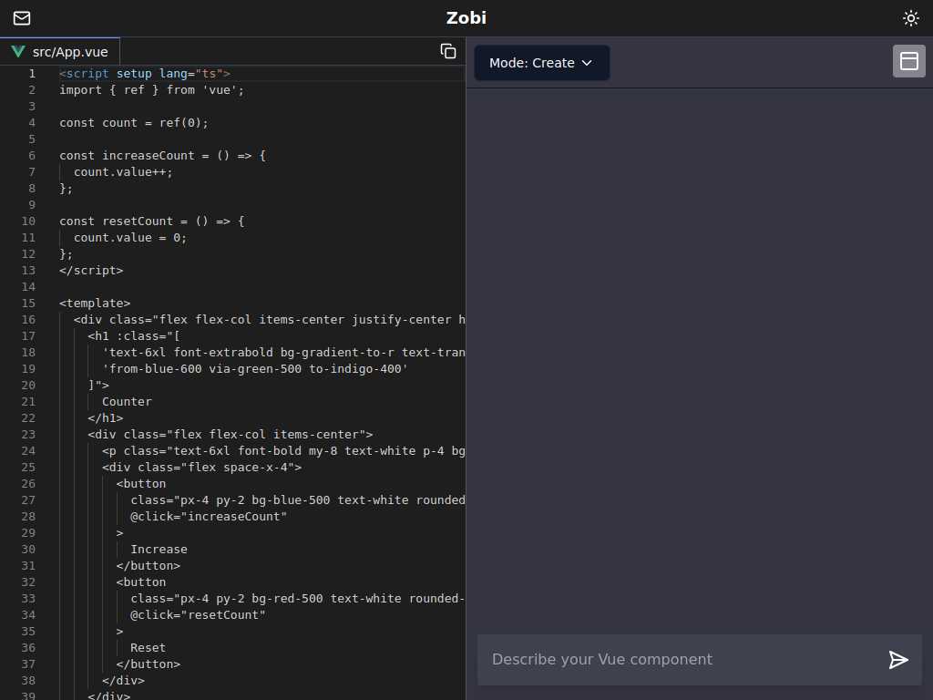
Vue.js Counter Component with Increment and Reset Features
Average rated: 0.00/5 with 0 ratings
Favorited 0 times
Rate this tool
About Zobi
Zobi is a sophisticated Vue.js web application template designed to seamlessly integrate interactive components like counters into your user interface. Featuring a user-friendly, modular code structure, Zobi offers both novice and experienced developers a powerful tool to build and enhance their web applications. Zobi's counter component demonstrates how effortlessly you can create dynamic, responsive, and visually appealing elements using Vue.js, ensuring your project stands out both in functionality and aesthetics.
Key Features
- Reactive state management using Vue.js ref
- Increment and reset functionality
- TypeScript support
- Dark themed user interface
- Gradient-stylized header
- Bold text for readability
- Rounded buttons for better UX
- Mobile-responsive design
- Simple CSS styling
- Easy to integrate into existing projects
Tags
Vue.jsCounterTypeScriptReactiveComponentTemplateUIIncrementResetGradientDesignDark BackgroundButtonsBold Text
FAQs
What is the purpose of the Vue.js Counter Component?
The component is designed to track a count that can be incremented or reset by the user.
How is the count state managed in this component?
The count state is managed using Vue.js's reactive reference and TypeScript.
What styling is applied to the Counter component?
The component has a dark gray background, rounded buttons, bold text, and a gradient-stylized header.
How can I increment the count?
You can increment the count by clicking the 'Increase' button.
How can I reset the count?
The count can be reset to zero by clicking the 'Reset' button.
Is the component mobile-responsive?
The component is designed with a flexible layout that adjusts to various screen sizes.
What technologies are used in the Counter component?
This component uses Vue.js for reactive data handling and TypeScript for type safety.
Can this component be customized?
Yes, the component's styling and functionality can be customized as desired.
What is the purpose of the gradient-stylized header?
The gradient-stylized header enhances the visual appeal of the component.
Is any external styling library used?
No external styling library is mentioned; the component uses basic CSS for styling.